
top explained visually
Posted on February 21, 2017 • 5 minutes • 916 words • Suggest Changes
A while ago, I read this blog post htop explained visually. I liked the idea of visually representing htop, but beside the result of a visual representation it gives a good opportunity to dive in to those columns you silently have been ignoring for a large time. The author of the idea commented “_I hope this post and your comment inspire people to create visual explanations for other unix commands, especially those that pack a lot of information on one screen :)” _hence my attempt to do something similar with the much more widespread command : top. As an extra point, I also used Inkscape the more open version of Illustrator/Photoshop. (please note that you can make way, way more beautiful drawing in inkscape then what I made)
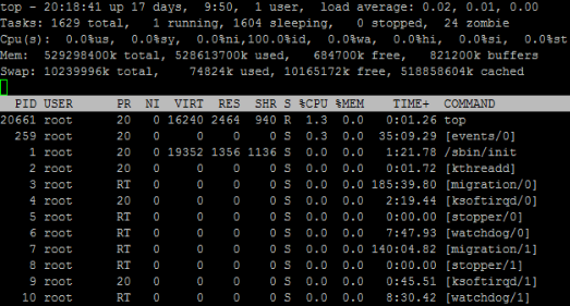
I guess all (most ?) distributions come with top so everyone should be able to just run it, there are some optional parameters but none are required; In case you have never seen top, its a full console application, similar to the windows “task manager”.
Now just like the original htop post, I split the “header” and “body” part to make annotations more clearly. I also included some description below cause some just require more info and can’t be packed in a image. (or maybe they can and I just suck at infographic)
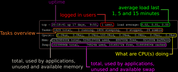
(uptime) The first line is exactly the same as the output of the command uptime this returns the (1) time since boot, (2) logged in users and (3) the average load of the last 1, 5 and 15 minutes. You can find out who is logged in, using the command w . Yes “w” is a command. The average load is a bit more difficult, basically for every CPU you can have 1 load. So a load of 1.7 over a quad-core is perfectly fine. You can find more online, but this seems a well written article (no affiliation).
(tasks) The next part is more interesting, it shows all tasks (total), the running tasks, the sleeping tasks the stopped tasks and the zombie tasks.
- running tasks : jobs that are currently on the CPU, while this system is extremely capable, for some reason top reports only 1 job running (htop shows 7) while that seems extremely low this is normal, as the scheduler switches processes super fast between running and sleeping and only one application is -in theory- running.
- sleeping tasks : these are jobs waiting in line to be run, these processes jump from running to “sleeping”
- stopped : perhaps there are more ways, but one way to “stop” a process is pressing control-z (sending a SIGTSTP)
- zombie : zombie processes are child processes that died, but the parent process was not waiting, hence the kernel marks those as zombie’s. (living dead proces) zombie processes don’t use resources, except for the use of a PID (those are limited) and the memory that requires.
(CPU) This is where the real juice is; Lets go over every value separate :
- us : user CPU time; this means time the CPU spend running applications ran by users that have not been niced (priority is default)
- sy : system CPU time, time the CPU spend doing kernel jobs
- ni : user niced CPU time; if a user has niced his process it gets marked differently, this could be good or bad. (see nice further)
- id : idle CPU; aka give it more work!
- wa : I/O wait; the CPU was waiting for I/O to come…
- hi : hardware interrupts; chatter between CPU and peripherals should be relatively minor.
- si : software interrupts; again should be minor.
- st : steal; CPU’s waiting while the hyper visor is servicing a different processor (seen in virtual machines)
Again, interesting read by scoutapp
(mem + swap) These speak for them self, the only weird part is the buffer/cached; Linux uses as much memory as is useful to it, this includes using cache for slow spinning disks. That means that the free amount of memory/cache is lower then what you would expect. Buffered and cached memory is available to applications when they request it, its just used since its sitting there. Read more about memory/swap management on LinuxatemyRAM.
We then see the “body” part of top, which (I was surprised) is very similar to the lower section of htop.
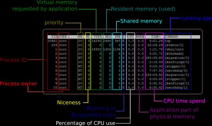
Most speaks for itself; some weird twerks I did not know, but I think is correct :
- PR : priority, this is the value the kernel uses, its based on nice value (see askubuntu) the RT stands for “real-time” and should be kernel tasks.
- NI : Nice, this is where you can see who has been nice (+20) or naughty (-19). Nice +20 means the process will not get as much CPU time as the naughty (-19). By default the niceness is 0 (zero). You can change the “niceness” using
renice - VIRT/RES/SHR : VIRT is the memory the application requested and has been allocated to the process, the RES is the actual in-use memory and SHR is the memory that overlaps with other processes and as such get shared. (de-duplicated)
man top actually is very useful, although a bit longish. Another useful tool is explainshell.com not as much for top, but for sure for more parameter heavy commands, such as tar/find/…
I don’t think visualizing commands in Linux is going to become a thing soon, but the Inkscape practice and some mad googling practice for sure was fun. I hope you enjoy it. 🙂